Install the app
How to install the app on iOS
Follow along with the video below to see how to install our site as a web app on your home screen.
Note: This feature may not be available in some browsers.
You are using an out of date browser. It may not display this or other websites correctly.
You should upgrade or use an alternative browser.
You should upgrade or use an alternative browser.
Other Fandom FanArt #4-Showcase & Requests
- Thread starter Jacquie
- Start date
- Status
- Not open for further replies.
Sorry for double posting
one icon I didn't entered in Bones LIMS challenge:

csifann1 double posting is allowed when 24 hours have passed between you posts and nobody has posted between them
Urban Legend
Captain
Two random icons I made to kill some time:


and two more from My Bloody Valentine:


and two more from My Bloody Valentine:


Last edited:
Urban Legend
Captain
Miss_Undercover
Judge
happyharper13
Pathologist
Wowza. These are all gorgeous! And the Buffy and Angel stuff is beautiful!
I love what you did with the contrast in the lighting and text for the Angel and Spikie icons, something_wicked. It's so hard to get something to look right when the text is brighter than the icon, and I am totally in awe of how you made that work. I loved the big multi-fandom post. The Grace icon is absolutely gorgeous! I love the crop, and the lighting and everything make her look even more stunning than usual. And Jack and Karen are... Jack and Karen. A.K.A. made of win. :hugegrin: The lighting on the Rory icons is gorgeous and I love how her eye stands out. How did you do that?
I haven't seen Hugh Jackman in much, but these WPs definitely make me want to go check him out! I love the texture and text, and the contrast with the pretty tape brush, Miss_Undercover!
I love the coloring on the David Cook icons, Shazza! His eyes stand out especially beautifully on the second one. I also love how you got the greenish tints without making him look green. I am very jealous
CSIfann- That golden text Booth icon is beautiful, and so clever and creative. I love the seamless blend between the two images. If these are all ones that you didn't post in the Bones LIMS, I really can't wait for you to post the one that you did enter! They're all amazing!
FieldMouse- I love the Buffy icons! The idea for the Willow one is especially awesome! Very creative and well executed. And I really like the lighting on the Dru and Spike 140. How did you get that lighting over their faces? It looks really cool!
GNRFan- Yay for more awesome Buffyness! I especially love the Spike and Buffy one. The blending is really well done and the text fits perfectly :bolian:
Hannah- the first one is so sad, but so well done. I miss BA ;( And I love the expression on Cordy's face in the second. Cordy = priceless. Awesome caps, and great, laugh-out-loud captions!
I have a few Buffy icons from the challenge:


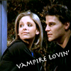
140x140
One question -- what exactly is the policy on constructive criticism on the fanart threads? I've just started getting into fanart. I always feel like I'm kind of lost on what makes good fanart good, and how to improve it, and I'd really love advice on how to make any of my stuff better. Any suggestions on any of my icons would be very much appreciated. I have very thick skin and can handle any level of criticism.
I love what you did with the contrast in the lighting and text for the Angel and Spikie icons, something_wicked. It's so hard to get something to look right when the text is brighter than the icon, and I am totally in awe of how you made that work. I loved the big multi-fandom post. The Grace icon is absolutely gorgeous! I love the crop, and the lighting and everything make her look even more stunning than usual. And Jack and Karen are... Jack and Karen. A.K.A. made of win. :hugegrin: The lighting on the Rory icons is gorgeous and I love how her eye stands out. How did you do that?
I haven't seen Hugh Jackman in much, but these WPs definitely make me want to go check him out! I love the texture and text, and the contrast with the pretty tape brush, Miss_Undercover!
I love the coloring on the David Cook icons, Shazza! His eyes stand out especially beautifully on the second one. I also love how you got the greenish tints without making him look green. I am very jealous
CSIfann- That golden text Booth icon is beautiful, and so clever and creative. I love the seamless blend between the two images. If these are all ones that you didn't post in the Bones LIMS, I really can't wait for you to post the one that you did enter! They're all amazing!
FieldMouse- I love the Buffy icons! The idea for the Willow one is especially awesome! Very creative and well executed. And I really like the lighting on the Dru and Spike 140. How did you get that lighting over their faces? It looks really cool!
GNRFan- Yay for more awesome Buffyness! I especially love the Spike and Buffy one. The blending is really well done and the text fits perfectly :bolian:
Hannah- the first one is so sad, but so well done. I miss BA ;( And I love the expression on Cordy's face in the second. Cordy = priceless. Awesome caps, and great, laugh-out-loud captions!
I have a few Buffy icons from the challenge:


140x140
One question -- what exactly is the policy on constructive criticism on the fanart threads? I've just started getting into fanart. I always feel like I'm kind of lost on what makes good fanart good, and how to improve it, and I'd really love advice on how to make any of my stuff better. Any suggestions on any of my icons would be very much appreciated. I have very thick skin and can handle any level of criticism.
Urban Legend
Captain
I love what you did with the contrast in the lighting and text for the Angel and Spikie icons, something_wicked. It's so hard to get something to look right when the text is brighter than the icon, and I am totally in awe of how you made that work. I loved the big multi-fandom post. The Grace icon is absolutely gorgeous! I love the crop, and the lighting and everything make her look even more stunning than usual. And Jack and Karen are... Jack and Karen. A.K.A. made of win. :hugegrin: The lighting on the Rory icons is gorgeous and I love how her eye stands out. How did you do that?
One question -- what exactly is the policy on constructive criticism on the fanart threads? I've just started getting into fanart. I always feel like I'm kind of lost on what makes good fanart good, and how to improve it, and I'd really love advice on how to make any of my stuff better. Any suggestions on any of my icons would be very much appreciated. I have very thick skin and can handle any level of criticism.
Thanks for the comments on my icons
The thing about constructive criticism is that everyone has different tastes. This is why I have to bite my tongue in the LIMS voting, because even though the rules state not to vote using 'personal preferences' but sometimes the way they word their votes gets on my nerves and you can tell that they are voting with what they like and not going by the rules. But I've also noted that Livejournal standards are not really the same on the board ... what users find stellar work on livejournal in contests, people on here seem to think differently on.
Good: "Icon is too dark, and the purple coming from the coffee mug seems out of place"
Bad: "It's too dark, and the purple makes the drink look toxic." :wtf: is that really a nice way to put it to help the icon maker, I don't think so
Needless to say if someone has something bad to say about my icons in lims, they need to make sure they word it in a good way or I am really close to going off on them. Okie dokie since I got that off my chest
I will give you some pointers on your icons
From what I see of the icons you entered into the Buffy challenge, I'd have to say that you're on a good start if you've only been making icons for awhile. The cropping is really nice and the coloring is crisp. The only thing I'd say you might need to improve is the text, depending on the program you're using (photoshop for me) you should try to right click on your text layer and rasterize your type, play around with the different settings because they each have different results, especially with different types. Also maybe try some types of textures and or brushes.
I hope this was any help
Last edited:
happyharper13
Pathologist
^Thanks so much! I know what you mean about voting subjectively. It's art, and it's always hard to separate personal preferences from aesthetic merit. Okay, this is probably a rather stupid question, but what does rasterizing text do?
Urban Legend
Captain
^Thanks so much! I know what you mean about voting subjectively. It's art, and it's always hard to separate personal preferences from aesthetic merit. Okay, this is probably a rather stupid question, but what does rasterizing text do?
I use Photoshop CS3 and rasterizing text allows me to add various effects to my text
Examples:
Without
With Drop Shadow which to me adds some depth to the text
With Drop Shadow as you can see with this one I made the shadow appear to be the color of the flames on the side and it looks as if the text is sort of on fire.
Using Inner Shadow
and this one works wonders sometimes and is my favorite to use
But some fonts look good with the effects, some do not it's always good to play around with different fonts
happyharper13
Pathologist
But can't you pretty much do all of those things with Layer Styles, regardless of whether the text is rasterized?
Urban Legend
Captain
But can't you pretty much do all of those things with Layer Styles, regardless of whether the text is rasterized?
You could do it, but my program if you try to do that by changing the layer styles the text sort of gets blurry and unreadable regarding to the text that is used. It's easier to rasterize the text than it is by using the layer styles.
happyharper13
Pathologist
But can't you pretty much do all of those things with Layer Styles, regardless of whether the text is rasterized?
You could do it, but my program if you try to do that by changing the layer styles the text sort of gets blurry and unreadable regarding to the text that is used. It's easier to rasterize the text than it is by using the layer styles.
Okay, cool. Thanks! I'll definitely try that next time. Thanks so much for all of the explanations
Hannah06_95
Police Officer
Here's some Twilight one's i just made! 3 icons and 1 banner!
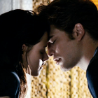

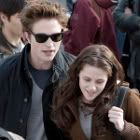
http://i153.photobucket.com/albums/s237/Hannah06_95/Twi2Trailer054.png


http://i153.photobucket.com/albums/s237/Hannah06_95/Twi2Trailer054.png
LOL thank you very much!I love the coloring on the David Cook icons, Shazza! His eyes stand out especially beautifully on the second one. I also love how you got the greenish tints without making him look green. I am very jealous
If you wanna know how I got that coloring I'd be happy to share! Just PM me!
Hannah - love the twilight stuff!! The second icon is my fav!
[43] Adam Lambert Icons
TEASERS:
the rest are here.
Enjoy!
p.s. constructive criticism is welcome. It's my first time using photoshop to make icons so any hints/tips/comments would be appreciated, I feel like my icon making skills have worsed because I'm using a program I'm completely new to.
Last edited:
LivingEnd
Lab Technician
Oh I haven't been around here in ages, everyone's posted great stuff in here.
I apologize, that I won't comment individually; it's just too much to catch up on, and I'd certainly forget somebody.
Sophia, I really like your coloring in those icons, I wouldn't have guessed that you are just getting started with ps.
I finally broke and got an lj, mainly to have a place to post my stuff, I'm still kind of trying to find my way around, it's all kinds of confusing...
I have some stock icons to share:


and a few more here
I apologize, that I won't comment individually; it's just too much to catch up on, and I'd certainly forget somebody.
Sophia, I really like your coloring in those icons, I wouldn't have guessed that you are just getting started with ps.
I finally broke and got an lj, mainly to have a place to post my stuff, I'm still kind of trying to find my way around, it's all kinds of confusing...
I have some stock icons to share:
and a few more here
- Status
- Not open for further replies.


