Install the app
How to install the app on iOS
Follow along with the video below to see how to install our site as a web app on your home screen.
Note: This feature may not be available in some browsers.
You are using an out of date browser. It may not display this or other websites correctly.
You should upgrade or use an alternative browser.
You should upgrade or use an alternative browser.
CSI: New York Icons #5 - Showcase, Links, and Requests
- Thread starter CSI_Kat
- Start date
Urban Legend
Captain
Some icons I just made:


Nikky, those are fab, I especially love the hearts on the first and font on the second, but yeah, they're great.  Well done.
Hannah06_95
Police Officer
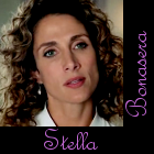
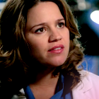
Here's two Icons from me! 


addictedtoSpeed
Judge
Love the Mac icons, especially the font Something_Wicked!
Great Stella and Lindsay icons Hannah06_05!
Great Stella and Lindsay icons Hannah06_05!
Urban Legend
Captain
Thanks for the comments on the Mac icons :lol: That man ... though he is 31 years older than me :guffaw:  Gary is just one of those guys that gets better looking with age, if you ask me
future_cop
Lab Technician
Haha long time no see everyone lol my apologies,I've been without internet so I come baring three gifts for you Mac Lovers
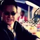
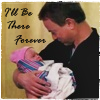
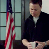
As always awesome icons all around love the Mac ones Something_Wicked
As always awesome icons all around love the Mac ones Something_Wicked
Urban Legend
Captain
I know what you mean wicked! (ok if I call you that?!) Love the icons, did you use a font for the hearts or was that a brush?
Hannah, your icons are lovely. Especially like the Lindsay icon, it's pretty.
Yeah the hearts are some brushes I got from somewhere. When I figure out where I got them from, I'll let you know. If i can't find out, I'll pm you with a link to a zip, if you want them
Mine from the ladies challenge:
 I colored her eyes green on this one, but it didn't stand out/show up as much as I wanted it to. The name thing was an oopsy. I put her whole first name on there, but for some reason photoshop cut it off after the first L so I just left it like that. :lol:
A different version I didn't use:

 big version
Lindsay small version
big version
Jess small
big version
More Here at My LJ.
A different version I didn't use:
Lindsay small version
big version
Jess small
big version
More Here at My LJ.
Last edited:
happyharper13
Pathologist
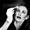
I love the icons, GNRFan! The picture and Stella's expression are beautiful in black and white, and I love how well the text hilariously matches the pic on the third. I have to say that I think I like the second better than the first. I love the reflection and the way it's cropped so that it's not equal on both sides and so that it follows the rule of thirds. It gives it a beautiful asymetrical feel.
From the NY Ladies icon challenge (I made three versions after the fact) --


From the NY Ladies icon challenge (I made three versions after the fact) --
