Install the app
How to install the app on iOS
Follow along with the video below to see how to install our site as a web app on your home screen.
Note: This feature may not be available in some browsers.
You are using an out of date browser. It may not display this or other websites correctly.
You should upgrade or use an alternative browser.
You should upgrade or use an alternative browser.
CSI : Miami Icons #5 - Showcase, Links, and Requests
- Thread starter Dragonfly
- Start date
- Status
- Not open for further replies.
WOW! so many amazing icons around here I hate the fact that work is taking over so much of my spare time and as a result I'm not able to do as much icons as I usually do...
Anywayz super quick comments:
Kat - amazing work, hahaha your H icons come out so good lol...
Ashley - Great job love 'em, nice simple and effective....
Luf100 - those are so good!! love the text on the first one!! nice job!!
I did a few Eva/Natalia ones (snaggable as always):


Enjoy!
Anywayz super quick comments:
Kat - amazing work, hahaha your H icons come out so good lol...
Ashley - Great job love 'em, nice simple and effective....
Luf100 - those are so good!! love the text on the first one!! nice job!!
I did a few Eva/Natalia ones (snaggable as always):


Enjoy!
katelynn
Lab Technician
Kat - You continue to amaze me..!! I love the first one one of Horatio (the second post you made), it reminds me of the one I made in my previous batch. Great job. I love the colouring you have with this batch... Again the phrases are amazing - I need you to help me with that with my icons! Are you used Adobe now?
luf100 - I looooove your icons. I love the shade of blue (well i guess not a shade) they are amazing. great job. I love your icons!!! Wow, i said LOVE a lot so far in this post!
Sophia - I can see a lot of growth in your work! I love how everyone is making 140x140 icons. I totally would but this is the only place that really allows them, i dont know why i dont. (unless its for my own personal use)..
I love the second Natalia one the most. Dont know why, just my favourite. I heart those pictures of her tho! Great job!
Here is my new batch
Teasers:


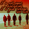
The rest of them are here at my Livejournal. For those who are always curious about the lyrics i use in some icons.... At the end of this batch I listed which icons are lyrics and the band and the song title just because i usually get a lot of PM's on LJ about it so i thought I would post them. Enjoy!!
luf100 - I looooove your icons. I love the shade of blue (well i guess not a shade) they are amazing. great job. I love your icons!!! Wow, i said LOVE a lot so far in this post!
Sophia - I can see a lot of growth in your work! I love how everyone is making 140x140 icons. I totally would but this is the only place that really allows them, i dont know why i dont. (unless its for my own personal use)..
I love the second Natalia one the most. Dont know why, just my favourite. I heart those pictures of her tho! Great job!
Here is my new batch
Teasers:


The rest of them are here at my Livejournal. For those who are always curious about the lyrics i use in some icons.... At the end of this batch I listed which icons are lyrics and the band and the song title just because i usually get a lot of PM's on LJ about it so i thought I would post them. Enjoy!!
Last edited:
shazza, I love your style and colouring.  (By the way, DAVID COOK! Zomg. :drool
katelynn, I love the latest batch. You amaze me with your style, wonderful job! I'm going to take a gander at your LJ and if I snag, I'll surely credit.
And I'm sure I'll be back with more reviews of the icons from the previous page--since I haven't been here in ages.
For now, I'm looking to load my latest batch of 'To Kill a Predator' and 'All In' to LJ but here's a few teasers:


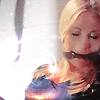
And Ryan.
Caps as always are from liten's Random Scribblings Gallery
katelynn, I love the latest batch.
And I'm sure I'll be back with more reviews of the icons from the previous page--since I haven't been here in ages.
For now, I'm looking to load my latest batch of 'To Kill a Predator' and 'All In' to LJ but here's a few teasers:


And Ryan.
Caps as always are from liten's Random Scribblings Gallery
Sophia - I can see a lot of growth in your work! I love how everyone is making 140x140 icons. I totally would but this is the only place that really allows them, i dont know why i dont. (unless its for my own personal use)..
I love the second Natalia one the most. Dont know why, just my favourite. I heart those pictures of her tho! Great job!
Thank You I appreciate that alot!! I know I <3 those pics of her too...she looks so pretty
You should make some in the bigger size just to see how they turn out...Hey if I asked you to make a few icons for me in the bigger size would be able to do that...but I can see why you don't...love your icons btw, left a comment at the LJ...
shazza, I love your style and colouring.(By the way, DAVID COOK! Zomg. :drool

Thank You I appreciate that too!! I love your icons too the composition is great! the Calleigh one is totally my fav...(By the way, I know....I love your avatar too :lol:
Okay I'm in a Lyrical Text Mood...but I believe there's probably only one person here who will actually recognize the songs/lyrics...:lol:


Enjoy!!
Okay guess the text thing wasn't a good idea those look way too overcrowded to me.....
Last edited:
katelynn
Lab Technician
Sophia - yup i can make you icons at the bigger size... it's not a problem!
With your new icons the text looks fine. But i will make a suggestion, if you're having a lot of words in an icon, the best thing to do is try to limit the amount of space between each line. I forget what program you're using but I'm sure they have an option where you can decrease the line space.
But they look good - so dont worry about it. thanks for commenting at my LJ, The third icon of yours is my favourite!!!! but i really love the delko one too!
starzsgirl
Captain
Sophia, I like your icons, the coloring is great and the text fits them all.  It also might not be the amount of text but the size, perhaps scaling it down a bit will draw the attention to both the subject and the text. Just remember trial and error, no harm in either.
  *hugs*
I come bearing two Ryan icons...got a bit bored. :lol:


I come bearing two Ryan icons...got a bit bored. :lol:
Last edited:
Thanks for the compliments re my icons. 
shazza, another great round of icons from you! Your colouring is great. I love the third one best.
Like everyone else said, scaling down the size might work a bit better. Maybe you could post each lyric as a separate text layer? That way you can manually move the text spaces closer together. Just one suggestion anyway. But I think the text goes together very well with the first and third one.
wolfesgamergirl, cool Ryan icons. I love the crop on the first one and the brightness of the second one and your text is awesome--I love the second one most, though. And that little heart gives a great touch.
I come bearing more icons 'cause I finally got around to posting on LJ!
[28] CSI:Miami (All In/To Kill a Predator/You May Now Kill The Bride)
[11] Various TalkCSI Icon Challenges
[8] David Cook.
Teasers:


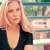
You can find the rest at my Livejournal.
As always, caps are from Random Scribblings
shazza, another great round of icons from you! Your colouring is great.
shazza said:Okay guess the text thing wasn't a good idea those look way too overcrowded to me.....
Like everyone else said, scaling down the size might work a bit better. Maybe you could post each lyric as a separate text layer? That way you can manually move the text spaces closer together. Just one suggestion anyway. But I think the text goes together very well with the first and third one.
wolfesgamergirl, cool Ryan icons.
I come bearing more icons 'cause I finally got around to posting on LJ!
[28] CSI:Miami (All In/To Kill a Predator/You May Now Kill The Bride)
[11] Various TalkCSI Icon Challenges
[8] David Cook.
Teasers:


You can find the rest at my Livejournal.
As always, caps are from Random Scribblings
Last edited:
With your new icons the text looks fine. But i will make a suggestion, if you're having a lot of words in an icon, the best thing to do is try to limit the amount of space between each line. I forget what program you're using but I'm sure they have an option where you can decrease the line space.
But they look good - so dont worry about it. thanks for commenting at my LJ, The third icon of yours is my favourite!!!! but i really love the delko one too!
Thank You so much!! Your too kind!! Glad you liked them and you know what I found the option where I can decrease the line space and the gap between the letters...so thanks for suggesting that!...
Sophia, I like your icons, the coloring is great and the text fits them all.It also might not be the amount of text but the size, perhaps scaling it down a bit will draw the attention to both the subject and the text. Just remember trial and error, no harm in either.
*hugs*
I come bearing two Ryan icons...got a bit bored. :lol:
Thank for the advise Sara...I guess I was just messing around to see how alot of text would look...ofcourse I'll scale down the size..thanks again
I love your Ryan icons they're totally cute...the second one is my fav....
shazza, another great round of icons from you! Your colouring is great.I love the third one best.
Like everyone else said, scaling down the size might work a bit better. Maybe you could post each lyric as a separate text layer? That way you can manually move the text spaces closer together. Just one suggestion anyway. But I think the text goes together very well with the first and third one.
Thank you so much!! I appreciate that alot!!...You are too kind...seriously...Thanks for the advice aswell but the only problem with doing a text layer for each lyrics would be that for some reason on GIMP when I try to move a text layer instead of moving the text it move the background...I don't why but it just does and its really annoying and confusing
I love you icons the Natalia icon is totally my fav....Your colouring is awesome!!! I'll leave a comment at your LJ later on!!
Okay so consider all the advice I made a few more icons:


Let me know what you guys think now!!
ETA: just realise how long my post is :lol: Sorry about that! :lol:
Last edited:
Don't appologize for that :lol:ETA: just realise how long my post is :lol: Sorry about that! :lol:
Lovely icons
- Status
- Not open for further replies.
