Install the app
How to install the app on iOS
Follow along with the video below to see how to install our site as a web app on your home screen.
Note: This feature may not be available in some browsers.
You are using an out of date browser. It may not display this or other websites correctly.
You should upgrade or use an alternative browser.
You should upgrade or use an alternative browser.
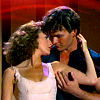
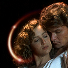
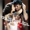
Misc LIMS #1: ' Challenge 12-Marilyn Monroe-Results
- Thread starter Urban Legend
- Start date
Urban Legend
Captain
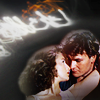
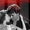
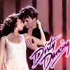
Re: Misc LIMS #1: ' Challenge 10-Dirty Dancing - voting'
MISC LIMS 1 Challenge 9 "Bones" Voting!
Total Number of contestants left: 7
Total Number of Icons entered: 6
Skips Used: 1
Voting Rules: (Please read)
~ Absolutely anyone may vote! You don't have to be an 'expert'")
~ Vote for the Top 2 of least quality, and the Top 2 of best quality.
~ Votes for least quality Must have a reason, or they will not be counted. Reasons for best quality are strongly encouraged
(the following examples may have been "borrowed" from other sources)
Good Examples:
34: Text is oddly placed
50: Icon is over sharpened
62: Image is too blurry
Poor Examples:
96: I don't like the colour (personal preference)
52: Tiny text/decorative brushes are unreadable (it's supposed to be that way)
As this has been an issue in the past, refrain from saying anything with how someone votes. If it falls under the poor examples criteria, either me or Jacquie will step in and address the voter.
- - - - -
01
 02
02
 03
03
 04
04
05
 06
06
MISC LIMS 1 Challenge 9 "Bones" Voting!
Total Number of contestants left: 7
Total Number of Icons entered: 6
Skips Used: 1
Voting Rules: (Please read)
~ Absolutely anyone may vote! You don't have to be an 'expert'
~ Vote for the Top 2 of least quality, and the Top 2 of best quality.
~ Votes for least quality Must have a reason, or they will not be counted. Reasons for best quality are strongly encouraged
(the following examples may have been "borrowed" from other sources)
Good Examples:
34: Text is oddly placed
50: Icon is over sharpened
62: Image is too blurry
Poor Examples:
96: I don't like the colour (personal preference)
52: Tiny text/decorative brushes are unreadable (it's supposed to be that way)
As this has been an issue in the past, refrain from saying anything with how someone votes. If it falls under the poor examples criteria, either me or Jacquie will step in and address the voter.
- - - - -
01
05
egeria
This mod is Ready for the Laughing Gas!
Re: Misc LIMS #1: ' Challenge 10-Dirty Dancing-Voting'
Least:
3. The double image makes the icon look blurry and the addition of the text/light texture makes the image too busy.
4. The crop is a little unbalanced and the red light over b&w doesn't really mesh.
Best
2. I love it, looks like an album cover!
1. Nice and sharp and bright. Lovely.
Least:
3. The double image makes the icon look blurry and the addition of the text/light texture makes the image too busy.
4. The crop is a little unbalanced and the red light over b&w doesn't really mesh.
Best
2. I love it, looks like an album cover!
1. Nice and sharp and bright. Lovely.
Re: Misc LIMS #1: ' Challenge 10-Dirty Dancing-Voting'
Wow! These icons are great... this is gonna be hard.
LQ:
05- A bit blurry, especially the text.
04-crop is a bit unbalanced
BQ:
02- I love this one. It's just put together really well. The placement of the light texture is perfect.
06- Love the crop and I love how the light texture sort of frames around the couple.
Everyone did an awesome job this round. It gets harder and harder to vote each time.
Re: Misc LIMS #1: ' Challenge 10-Dirty Dancing-Voting'
Least:
03 - The second image makes it look somewhat blurry.
04 - Looks little grainy and the crops a bit unbalanced.
Best:
06 - Really simple, but effective, works well.
01 - Again simple, but works really well.
Least:
03 - The second image makes it look somewhat blurry.
04 - Looks little grainy and the crops a bit unbalanced.
Best:
06 - Really simple, but effective, works well.
01 - Again simple, but works really well.
addictedtoSpeed
Judge
Re: Misc LIMS #1: ' Challenge 10-Dirty Dancing-Voting'
Least Quality:
05-the icon is a bit blurry and unsharpened
03-the double image makes it blurry and with the text it's sort of busy
Best Quality:
01
06
Least Quality:
05-the icon is a bit blurry and unsharpened
03-the double image makes it blurry and with the text it's sort of busy
Best Quality:
01
06
starzsgirl
Captain
Re: Misc LIMS #1: ' Challenge 10-Dirty Dancing-Voting'
Least:
3 - The over all icon is blurry, plus the double image right in the middle with the words throws the composition off.
4 - While the black and white with the color was a great idea, there isn't a flow to the icon and the light over takes his head.
Best:
6
5
Least:
3 - The over all icon is blurry, plus the double image right in the middle with the words throws the composition off.
4 - While the black and white with the color was a great idea, there isn't a flow to the icon and the light over takes his head.
Best:
6
5
Re: Misc LIMS #1: ' Challenge 10-Dirty Dancing-Voting'
Least
2 - Is that part of the texture on their hair? Not sure I like that if it's on purpose.
3 - Double image is a good idea, but here it makes the icon too cluttery looking for me.
Best
1 - Nice contrast, and the texture goes well with the icon coloring.
6 - Nice cropping, and I like the way the light in the texture kind of wraps around them.
Miss_Undercover
Judge
Re: Misc LIMS #1: ' Challenge 10-Dirty Dancing - voting'
Least:
6= The icon is too dark and oversharpened
4= Looks too grainy, contrast is missing
Best:
1= Nice cropping anf colouring. Looks really great !
2= The light texture fits marvelous with the cropping of the icon. Nice work !
Least:
6= The icon is too dark and oversharpened
4= Looks too grainy, contrast is missing
Best:
1= Nice cropping anf colouring. Looks really great !
2= The light texture fits marvelous with the cropping of the icon. Nice work !
Urban Legend
Captain
Re: Misc LIMS #1: ' Challenge 10-Dirty Dancing - results'
This round we'll be saying goodbye to:
 by (cathwillows) halloweellows and
by (Dragonfly) Nevermore
by (cathwillows) halloweellows and
by (Dragonfly) Nevermore
Voter's choice:
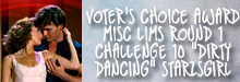
Seriously Wicked:
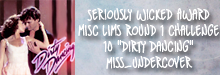
This round we'll be saying goodbye to:
Voter's choice:
Seriously Wicked: