DetHiggins- Awesome work! I love how unique the icons feel, even while they don't feel out of place (hope that makes sense). They just seem incredibly creative, as well as gorgeously executed. I love the lighting and coloring on the first one, and the text and mist around it on the second one works so well. Perfect expression. And the third one! So creative, so interesting and so well done! I love the idea with the text, the crop and just everything. Gorgeous work!
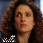
Mariana- I always love your stuff! Gorgeous coloring, once again. I love the amount of fun that you injected into the 100x100 icons, through the brushes and coloring and everything. It just makes the actors seem like people you'd want to hang out with, ya' know? Gorgeous text on the Carmine one, and I love the use of drawn-back light coloring and how it brings out his eyes. The first Stella one is so unique and just so fun. And the second one is gorgeous too. I love the use of shadows and lighting on the 140x140. Very mysterious. I'm fairly certain that I voted for the 140.
Adorable_Crazy- I love the lighting and crop on the first AJ icon. He looks black and white, but it still feels like he has color in him. It always amazes me when icon-makers are able to do that. The coloring on the EC icon is gorgeous, and I love how bright the background is, but also how strongly colored he is to the point that he can still very much hold his own against the bright background (hope that makes sense). And I love the use of lighting and crop on the second AJ one. It really feels like he's looking into the light, from the dark.
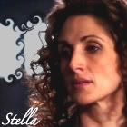
LivingEnd- Wow! Just wow! Perfect crops, perfect coloring, perfect use of cool effects that I don't even know how you made! Just wow! The first Stella one is especially amazing! It reminds me of old movie posters and their glamorous stars. The crop and the coloring on that one just absolutely bowl me over. Gorgeous work!
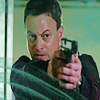
Kristine- Gorgeous coloring overall, and AWESOME choice for the first cap! Gotta love a good hockey fan (especially when he's rooting for one of the right teams). I love how you brought out the lightness and blue in his eyes in the second and third one, and the 'Rock On' text definitely rocks!
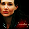
MacsLovlyAngl- Awesome job! I especially love the Stella icons in the first post and the second Stella icon (second post)! In the fourth Stella icon, the black background works gorgeously, and I love the lighting and coloring on her face. It's just stunning! I also really like the way you did the text on the third Stella icon. The first and second ones are just gorgeous. Love the lighting and the text and fonts. I especially love how well executed the vertical text is on the second one.
Axelsonfire- I love the level of detail in your close-up entries. They are challenge-perfect
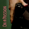
")
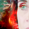
The Angell one is especially gorgeous. I love the way the simplicity and coloring of the background really makes her face (and especially her eye) stand out so much more. And I love how green you got Stella's eye, and the way you can still tell she's smiling in the icon
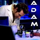
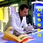
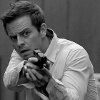
Something_wicked - I love the lighting and crop on the Danny microscope one! Your Adam 100x100 icon for the actors challenge is gorgeous, and i love the smokey feel by the text, and the overall classy feel of the icon. Awesome coloring on EC's face for the second one, and the 140x140 is just adorkable
Love the brush and texture/box, and the brush and text fit perfectly. The Carmine one might be my favorite. Subtly beautiful texture coloring, and I'm definitely a sucker for the checkered canvas-esque backgrounds
GNRFan- The first Stella 100x100 for the actors challenge is gorgeous! Just gorgeous! And the 140 is so fun! Love the text and crop for the EV one. Awesome cap and crop for the Flack one, and I love how light the coloring is on the icon. It really brings out the tongue!porn all the more. And the Mac icon is awesome. I love the subtle coloring and brush. That most recent Mac one might be one of my faves of yours so far
It's gorgeous!
Nat_Attack, I know your icon isn't showcased, but I love it! It is amazing work! As a slasher, it is so nice to see icons like yours
Sam222- Awesome caps and icons! I love how the icons really fit together! I loe the crop on the second one. You can really see every detail in his face, and I love how it still feels like he's so much in motion because of the way it's capped. I really feel like he's leaning back to talk to me. In the first one, the black and white works so well, and he just stands out very well.
Future_cop- gorgeous coloring on those, and strong crops
I love how they all look poised for action of some sort. I love the faded coloring over the background in the Danny one, and the way it really brings out him. The Mac guitar one is also awesome, and the background is so fun! Perfect crops on all of them! And your MJ icon and banner make me ;( Gorgeous, haunting icon, with perfectly bright coloring that still feels melancholy.
LyzabethSay- I commented on your LJ, but will comment here too because I absolutely love your stuff. The EV one for the actors challenge was absolutely gorgeous! I'm fairly certain that that got my first place vote for the challenge. The lighting and coloring is absolutely stunning. The coloring on the Stella icon is subtle, but equally stunning, and I love the texture and brush on the first EC icon for the actors challenge. Hilarious captions for the Adam ones! The first Hawkes icon has the most hilarious caption, and the crop is wonderful, and, despite the fact that Lindsay is definitely not my favorite character, I'd have to say that the Lindsay banner might just be my favorite. The coloring is just perfect. Absolutely perfect, as is the crop, the blue light behind her... just wow. Gorgeous work!
I have a bunch of new stuff:
The rest are
at my LJ. Constructive criticism is (per usual) always very much appreciated.